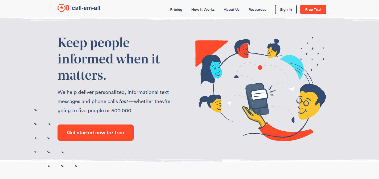
Today we launched a new look for our brand and website. With this redesign, we had the unusual goal of showing off our culture and values while creating a long-lasting style for our brand. We live by our values because it helps us - and our customers - be successful. We hope to inspire others to be different, to be bold, and to do the right thing - even when no one's looking.
We partnered with Salted Stone, an agency that takes equal pride in building great culture and a partner we'd gladly recommend, to come up with a branding concept that reflected our unique approach to doing business.
We also made a few changes to how we organize the content on our website that make it easier to find important information.
- additional "how it works" for calling and texting products
- pricing plan calculators to help determine the best fit
- new sections for resources and inspirational tips
We're excited to share these changes and why we made them.
Why we wanted to make a change
Over the years, we've primarily been a calling company, but the last few years have brought dramatic growth in text services. Combine this with our ongoing focus on culture, and further clarification of our values and purpose, and we started to feel like our website could be improved to better represent what it's like to work with us. Culture, after all, is the one thing we consider to be our most significant competitive advantage.
Today, the website showcases the value we provide to customers and the #positiveimpact we bring to our community, customers, and each other. This isn't just another cookie-cutter website full of product screenshots and keeps who you're working with and what your journey is going to be like a mystery.
Whether it's the playful aspect of our About Us page or the glowing customer testimonials throughout the site - hopefully, you'll start to get a better sense of why clients rave about working with us.

What we changed
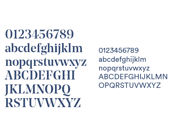
We've selected strong, clean, and modern fonts (Noe Display & Circular) designed to be easily read within digital devices. The relationship between these and our graphic motifs illustrates the equal importance of working hard and laughing 'til it hurts, core principles of our Call-Em-All culture.

Salted Stone was able to craft a unique style that mirrors specific elements of our culture that we wanted to make more apparent throughout the customer journey. The main design motifs were inspired by the Japanese wabi-sabi aesthetic, based on the beauty of imperfection and authenticity (one of our core values). Organic swashes and geometric shapes with roughened edges directly represent having the courage to be imperfect. This style is reflected throughout our website in icons, backgrounds, graphics, photography, and product screenshots.

Like the wabi-sabi motifs, the icons are hand-drawn shapes with subtle imperfections. The thick and thin, unpredictable broken lines also help to give the icons a human quality. These visual changes primarily apply to our main website; the design of our customer application remains unchanged.
![]()
If you're interested in getting a more in-depth look at our culture, or even stopping by our office for a visit, contact us at marketing@call-em-all.com.
Established in 2005, Call-Em-All is a mass messaging platform for organizations and businesses of all sizes. Our core offering enables users to send text and/or voice broadcasts to large groups. Since year one, the company has continued to grow by putting a focus on providing exceptional customer experiences, both through customer service - and an easy-to-use application. Based in Frisco, TX and still privately held, the Call-Em-All founders are equally passionate about building an exceptional workplace and the radical idea that what's right for our team, customers, and community - is also what's right for the business. Today our service has been trusted by over 44,000 organizations, we continue to grow, our employees leave work smiling, and we remain profitable.


